 For full access to all OER Project resources AND our amazing teacher community,
Marissa Major, OER Teacher
Santa Cruz, USA
What are you doing during this “shelter in place” crisis? Maybe you’re watching a lot of Netflix, or working—from home or out in the world in an essential job. Maybe you’re avoiding the news. If you’re anything like me, you’re reading, watching, or listening to a lot of news, and in the process, you’re probably seeing a lot of charts that represent data. Some of these charts can be really difficult to understand; others look simple. Maybe a little too simple? I’m a mathematician, and I want to tell you what I see when I look at these charts.
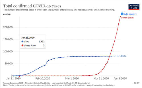 Coronavirus data filtered to show case numbers for China and the United States. By Our World in Data, CC BY 4.0.
Let’s start with a chart that chronicles how the total confirmed COVID-19 cases has developed by day in the United States and in China. When I look at this chart, I ask myself a series of questions:
- Do I trust the data?
The chart comes from the “Our World in Data” website. They in turn get their statistics from the European Center for Disease Prevention and Control (ECDC), a European Union agency that collects and compiles global COVID data, making it available to the public. The ECDC’s primary data, in this example, comes from the Chinese and US governments. Although this may be the best source available to us, I’m concerned that there could be inaccuracies in reporting numbers, both from medical facilities and the governments themselves.
- What is being left out?
The answer, it turns out, is “a lot.” Many cases. This chart only reports the number of confirmed cases. The actual number of cases is higher. “Confirmed cases” are cases where people were tested and found to be positive for the virus. Many more people were never tested. Therefore, when using this chart to understand the spread of the virus, an implicit assumption is that the growth of the confirmed cases is similar to that of the total cases, although the numbers may be different. Moreover, the arcs of the curves themselves are influenced by how testing has been carried out. For example, the US didn’t start aggressive testing until the latter part of March, which has contributed to the rapid rise in confirmed cases during that time. So, real-life factors affect the data!  Drivers line up for coronavirus testing in Montgomery County, Pennsylvania. By U.S. Air National Guard Senior Airman Wil Acosta, public domain.
- What does this chart actually tell us?
Let’s consider the main features of the graph. This graph represents total confirmed cases, so it makes sense that the line should be increasing, as the value for each day represents the total number of cases identified up to that date. In this kind of chart, the best possible scenario is a flat line, meaning no new cases.
I can also see that the total confirmed cases is increasing for both the US and China, but in very different ways. The US seems to have had little to no growth until mid-March, when cases started to increase rapidly, while China was hit early but is keeping its total cases to just over 80,000.
To get a better idea of what this chart is telling us, I look at some particular points in the chart. What I find is that the growth of confirmed cases in the US is exponential. The US had one case on January 21, which doubled to 2, 4, 8, and then 16 by February 21. After the number of cases doubled twelve times, on March 11 the number of confirmed cases rose to 1,025. At that point, each doubling meant that we were adding many more new cases. Thus, the real number of cases started to increase very quickly. This is exponential growth: Slow in the beginning, then faster and faster, which accounts for the curve’s steeper and steeper rise.
In contrast, China’s curve started out increasing exponentially, but around February 13, the curve flipped. This flip indicates that the growth rate was decreasing after that time, and the curve flattened out in the beginning of March.
- Let’s get specific.
Finally, in my attempt to understand the implications of the data, I ask myself whether this chart shows that the spread of the virus is speeding up or slowing down in the US.
Due to the nature of the virus and our response to it, the time it takes the number of cases to double is changing. We can estimate the most current doubling rate by taking the most current value on the graph (245,540 on April 3), and then looking for the day that has as close to half that value as we can get (124,665 on March 29). This gives us evidence that the US cases doubled in five days in the most recent period. To compare, the cases more than doubled between March 25 and 29 (55,231 to 124,665), which indicated a doubling rate of just less than four days. So, in the more recent period, doubling seems to have slowed very slightly.
When we speak of “flattening the curve,” we mean we want this doubling curve to become more gradual—more shallow—until it reaches a peak, instead of looking like an ever-increasing slope ascending into the clouds.
If the source data in this chart is reliable, it looks like China has succeeded in flattening its curve. Although the evidence is very preliminary, for the US, a decreasing doubling rate is an indicator of the curve flattening. It means the virus is losing steam. However, it may instead be evidence of less widespread testing done this last week, or of something else. Can you think of another explanation?
Done with my exploration, I’ll present my conclusions.
The epidemic hit China first, and the outbreak in the US started later. China’s curve seems to show evidence that the measures taken there were successful, thereby giving a possible indication of what works against the virus. Though the view is more distorted because there has been less testing, the epidemic in the US does not seem to be under control and is seeing confirmed cases doubling at least every five days.
This graph supports the claim that the US needs to take stronger action. It should lead to policies that flatten the curve. As to predictions on the future situation in the US. we have evidence, as described above, that the doubling rate has decreased—a potentially good sign—but it is not a clear enough pattern yet for me to conclude that the curve in the US is flattening. We need to continue to watch the data.
About the author: Marissa Major holds a master's degree in pure mathematics from Portland State University and has taught all levels of undergraduate mathematics for the past five years. Her current goal, using writing, research, and curriculum development, is to promote mathematical thinking as a tool to gain more knowledge about the world and improve the lives of those in it.
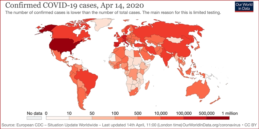
Cover image: Our World in Data world map showing total confirmed COVID-19 cases as of April 14, 2020. CC BY 4.0.
Top Comments