 For full access to all OER Project resources AND our amazing teacher community,
By the OER Project Team
If you had a crystal ball that let you see into the future, what would you want to know? What would you look for? If you didn’t say “My likelihood of being killed by ice cream or Nicolas Cage films,” then I have some concerning news for you:
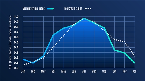 Correlation does not equal causation: Violent crime index vs. ice cream sales. By WHP, CC BY-NC 4.0.
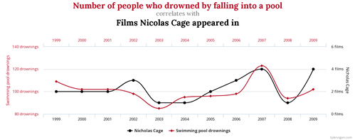
Spurious correlations, by Tyler Vigen, CC BY 4.0
Now, because you’re the wise teacher that you are, you can probably spot some problems with these two charts. (If you can’t, maybe stay away from delicious frozen treats, films by Academy Award winner and American treasure Nicolas Cage, and the deep end, just to be safe.) But some of your students might have more trouble recognizing that correlation does not necessarily equal causation. These two charts might be misleading, but they’re also pretty absurd, and most students will notice that something’s a little weird here.
Your students are constantly bombarded with representations of data. More and more, they’re going to be the target of campaigns on social media and elsewhere that attempt to use numerical data and charts to influence their thinking. Without the tools to read charts and evaluate the data behind them, lots of students could be misinformed. As data becomes a bigger part of our lives, students must learn to be critical consumers of information. But you teach history. What are you supposed to do about it? Enter Project X, the new extension course from the OER Project team.
Project X is meant to help students understand and evaluate data and to use it in their own arguments. It can be taught as a standalone, four-week course, as an extension to any course, or as a progression within the WHP Origins and 1750 courses. Project X culminates in a final presentation in which students use historical data to predict the future and offer solutions to some of humanity’s biggest challenges.
Project X begins by asking students to consider the following prompt:
“You are a historian of the future, and data is your crystal ball. As our species confronts the challenges of the twenty-first century, we carry the knowledge and burdens of history. In Project X, you’ll use that knowledge of the past to predict the future. Choose one significant issue and use data to predict how it will change during your lifetime.”
If that sounds like a daunting task, don’t worry! We’ve got you covered. Project X materials are designed to guide students, step-by-step, in how to read charts, evaluate data, and make predictions. There are three main components:
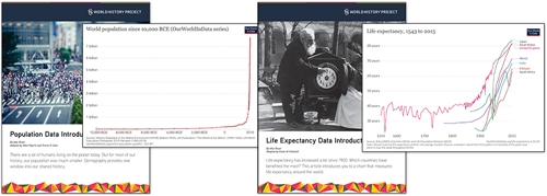
- Data Explorations: At the core of Project X are 10 exercises we call “Data Explorations.” These explorations are organized thematically around significant topics in world history. In these explorations, students will read articles and charts produced by Max Roser and the team at Our World in Data (OWID). (Learn more about OWID here: https://ourworldindata.org/.)
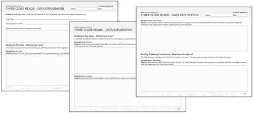
- Three Close Reads for Data: If you teach WHP, you and your students are probably pretty familiar with our Three Close Reads tool. For Project X, we’ve adapted this tool to walk students through the process of reading and evaluating charts and the data they’re based on. No experience with the Three Close Reads tool is required, however.
- Final Project Activities: Project X includes a series of scaffolded activities that culminate in a presentation in which students make a prediction about the future, support their prediction with data and historical narratives, and propose a plan of activism to prevent or ensure the future they predict.
Project X is a great way to introduce students to a new type of evidence and prepare them to think critically about the numerical data they’ll encounter in their lives. We also think the Data Explorations and activities in Project X will help students make connections between historical trends and contemporary challenges like income inequality, international conflict, and climate change.
Click here to explore Project X in depth, or check out the Project X Guide for a course overview.
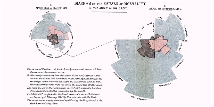
Cover image: Example of polar area diagram by Florence Nightingale (1820–1910). This "Diagram of the causes of mortality in the army in the East" was published in Notes on Matters Affecting the Health, Efficiency, and Hospital Administration of the British Army and sent to Queen Victoria in 1858. Public domain.
